
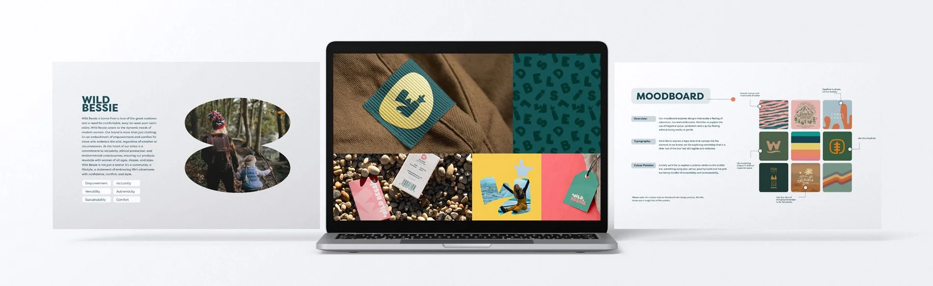
Wild Bessie
Wild Bessie, an Edinburgh-based brand, emerged from a love of the great outdoors and a need for comfortable, stylish post-swim (or adventure) attire. Our task was to develop a brand that embodies empowerment, comfort, and adventure, while staying true to values of inclusivity, ethical production, and environmental consciousness.
SarahCreated
Logo
Branding assets
Brand Guidelines
Charting the Course
We aimed to create a standout brand that combines style, functionality, and ethical production, appealing to women who love outdoor activities, particularly wild swimming and who live busy lifestyles which often don’t allow for much down-time after activities. The focus was on delivering exceptional branding and logo design that would set Wild Bessie apart in the up and coming market of wild swimmers, outdoor adventures, staycations and other water activities such as SUP and surfing.

Riding the Creative Wave
Diving Deep into the Wild Spirit
From the outset, we focused on crafting a brand that would resonate deeply with its target audience; the active, adventurous, busy woman. Our creative direction explored designs evoking adventure, fun and exhilaration, with an emphasis on negative space, symbolism and potentially a quirky, yet tasteful, vibe.
Crafting Waves of Joy: Logo Design
At the heart of Wild Bessie's identity was our logomark. We looked at incorporating the Hawaiian shaka hand gesture and ‘the horns’, along with raised arms to symbolise joy and freedom. I used negative space to depict a cresting wave or a road into the mountains, reinforcing the adventurous spirit and the multi-usage of the core products.
The scalable logo system included a primary lockup for general use, a secondary lockup for flexibility, and an icon mark for smaller spaces. This is pivotel for any brand and ensures consistency across the various applications which are inevitable as a brand grows.
Colour Currents
Our colour palette was carefully chosen to reflect the brand's vibrant and adventurous spirit:
Coral Pink: Joyous optimism, nurturing comfort and a spirited sense of adventure.
Teal: A serene blend of tranquil blue and green vitality — a brisk swim or forest walk.
Yellow: Brings that invigorating feeling, energy, brightness and cheerfulness
Secondary colours like peach, light blue, white sand, and slate added warmth, calm, and depth.
Branding in Motion
With any new venture, it’s invaluable to visualise the brand in action. We created high-end mockups showing Wild Bessie branding on swing tags, products, towels, social media, and classics business cards (still a must for networking I feel!). These mockups demonstrated how the brand could be consistently applied across different mediums, reinforcing its identity and values.
Making Waves
The final branding for Wild Bessie successfully captured the essence of the brand—a combination of empowerment, versatility, sustainability, inclusivity, authenticity and comfort. The adventurous and joyous spirit of the brand was brought to life through carefully crafter design, vibrant colours and a playful yet professional logo which has the capacity to grow with the brand. We also created comprehensive brand guidelines for Wild Bessie to continue rolling out the brand across social channels, more products, printed collateral and more.
As the Adventure Continues…
Working on Wild Bessie was a fantastic opportunity, one that I am incredibly proud to showcase in my portfolio. Our creative direction, strategy and execution have all positioned Wild Bessie as a distinctive, relatable and aspirational brand. As the brand develops I’ve no doubt that it will inspire women to embrace the wild with confidence and style.